Ava Choices full end-to-end system over-haul (Pilot 3)
Work completed at DPH Group
My role: Sole UX Designer, working with the Assistant Brand Manager
Skills used: Product thinking, User Flows, Personas, Visual design, Prototyping
Duration: September - December 2021
Overview
Following a rebrand completed in the early summer and some small messaging test ads, the owners decided that the business model for Ava Choices needed a change. During several management meetings, I worked with them and the Assistant Brand Manager to outline our new user flow.
The primary change was that the ability to search and match with suitable care providers would now be before the registration stage, as we felt that not readily showing our customers what they could buy was our biggest barrier to conversions. It was decided that the best approach was to take all our previous learnings and undertake a full redesign and new build, aiming to launch both a website and an app.
Due to funding issues, the company is closing before build can start.
Users and audience
Ava Choices has two user types:
Consumers - 35+ year olds in the UK who require care at home services for themselves or a loved one. They are moderately affluent and do not have severe health issues, so do not qualify for funding from the NHS or their local council.
Providers - Care professionals who create profiles on Ava Choices to connect with potential customers in their local area.
Scope and constraints
Consumers need to quickly find care options that suit their specific needs and to request quotes. Some of our audience are not very tech-confident, but all are coming to Ava during a time of stress and urgent need, so simplicity is key.
Providers need to easily create their profiles to be found by the consumers, and to return a competitive pricing option to entice the consumer.
The business requires a solution to be created in a short time frame, as a result I was asked to skip over wireframes and proceed with initial designs. It also requires a subscription model to ensure a greater lifetime revenue value for each consumer. Charging the consumer a monthly fee poses the problem of how we could add value to them each month to justify the cost and keep them on-system.

Process
Working with the CEO, CMO and Assistant Brand Manager, I was part of a small group who attended a workshop where the brand’s new model was decided. The primary change was that the ability to search and match with suitable care providers would now be before the registration stage, as we felt that not readily showing our customers what they could buy was our biggest barrier to conversions. The target audience and service offering were also refined, focusing solely on consumers who require care at home services (removing care home providers) and do not qualify for NHS or council funding. I wrote new personas to reflect these changes, which the Assistant Brand Manager assisted with. These were then used to generate our User Flow maps which were presented back to management for business approval.
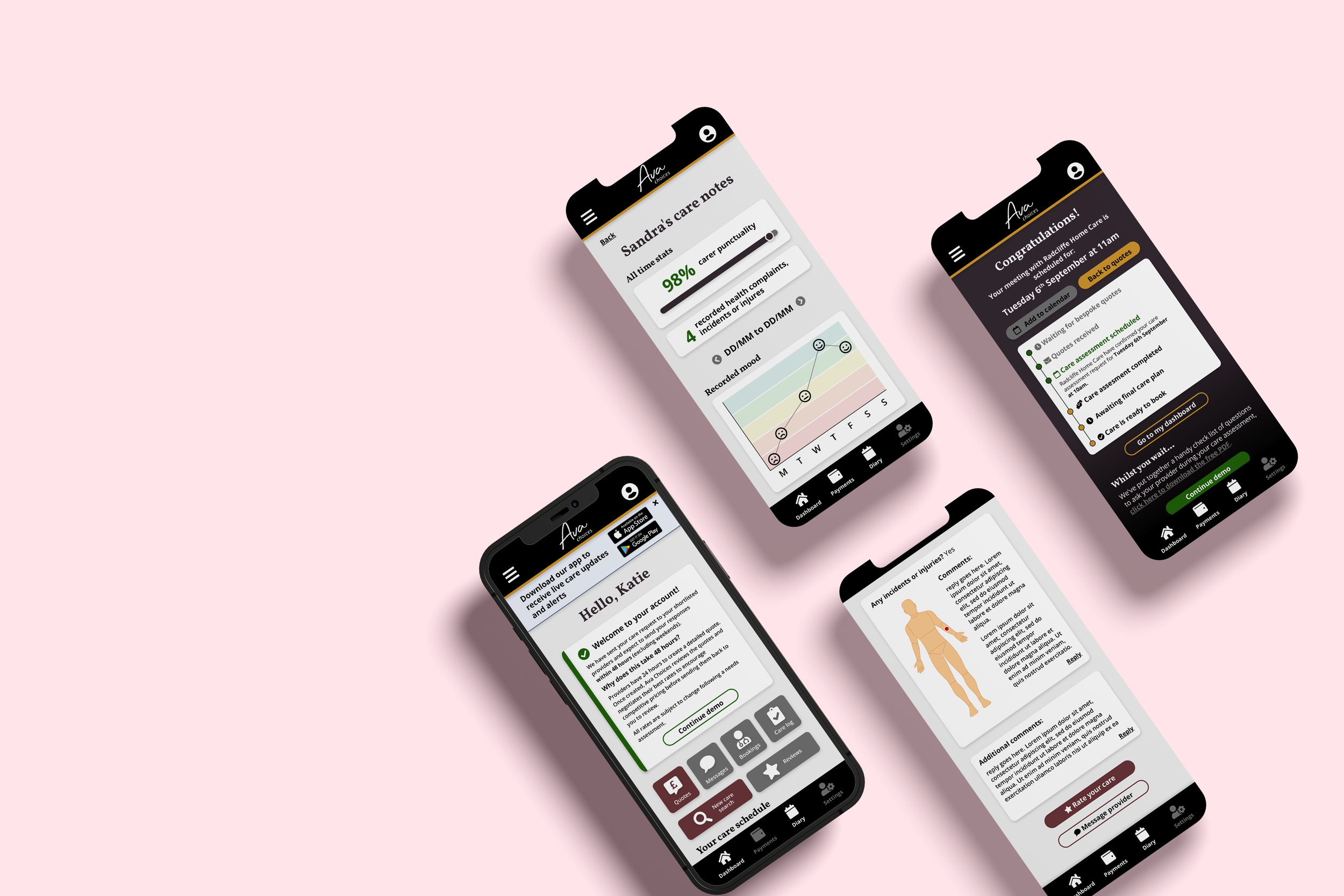
Consumer mobile prototype - Adobe XD
Once the User Flow maps were agreed, I progressed onto planning out the page content alongside the Assistant Brand Manager, who responsible for copywriting. I would then take the supplied wording and create the initial designs in XD, generating prototypes to present back to the company owners for approval. As I believe that there is always room for improvement, we would discuss all elements of the designs and wording as a team before making the appropriate amends to develop the system.
This process was repeated for both consumer and provider user types, focusing on mobile designs for consumers, but desktop for providers as I could see through Crazy Egg that this user type accessed our site through desktop the majority of the time.
To add on-going value to the consumers, I created a feedback system for care providers to add notes and comments about their visit, which the Assistant Brand Manager contributed to. This was aimed at the younger end of our audience who are searching for care for an older relative, with the intention of giving them piece of mind through seeing that the carer had attended, medication was taken and for the reporting of any health issues or incidents. A potential limitation of this being successful is provider compliance, so a line of enquiry was being undertaken to create our new platform in a way that could be integrated with providers’ existing management software packages through APIs, which could also feed into the system scheduling.
Owing to funding issues, the owners have made the decision to close the company before the information web pages were fully designed or build was started. The plan had been to conduct market research to inform the messaging on the information pages and to conduct user testing sessions on the prototypes ahead of commissioning an external build.
Provider desktop prototype - Adobe XD
Outcomes and lessons
Due to the project being incomplete and untested, it is hard to draw conclusions about the success of the new system. Based on the learnings from the previous versions, I feel confident that our new model would have generated more leads as consumers would be able to see the providers upfront. I also believe that the care visit notes would have improved the lifetime value of each consumer by encouraging them to stay longer on the system.
In future, I would conduct user testing earlier in the design process to ensure that the solutions are suitable for the target audience and their technical capabilities.
Related projects
-

Ava pilot feedback & insights
-

Ava Choices brand evolution


